ZeroTier has some really rough usability in some random-but-important places. It would be nice if some of these rough edges could get some love.
For example, the usability around removing members is super not great. The iconography, wording, and tooltips for these important actions are very confusing.
Problems
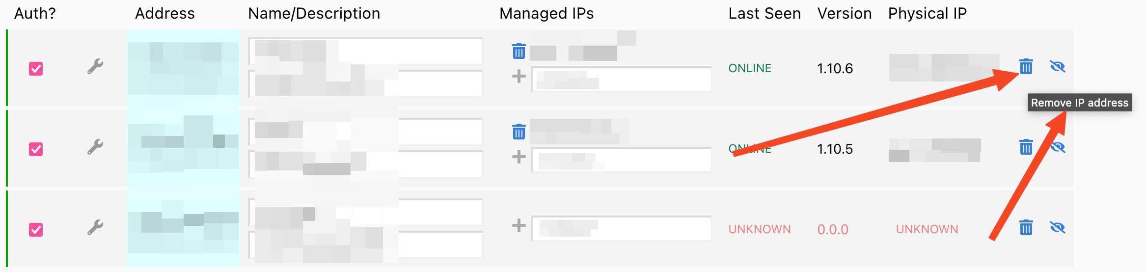
Why does trash have “remove IP address” as the only tooltip when it is a ban? Why does it say “ip address” when it is the whole node that is being banned? The node can’t even attempt to rejoin without administrator intervention, so this is a ban, right? Even the wording “Delete” (from the help article) isn’t clear. “Undelete” being used in the UI should be a hint that this is confusing.
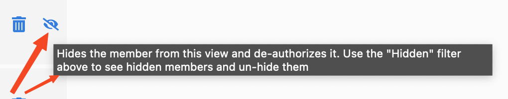
Having an eye with a cross through it and calling it “Hide” doesn’t imply de-authorization and removal from the network. The tooltip saying this is a “deauthorize” action really surprised me the first time I read it. Like, what is being hidden from what? I get that “Hide” is trying to imply the action is reversible but it’s trying to do too much work. The node is being removed from the work. “Hide” is the wrong word here.
In short: a person first encountering this UI will likely not know which to click. There isn’t enough information in this UI to confidently act.
Suggested New Actions
| Action | Icon | Tooltip |
|---|---|---|
| Ban | Ban node. Node may not rejoin the network without an administrator manually lifting the ban. | |
| Remove | Removes and deauthorizes node. Node may rejoin anytime. A node that rejoins will need to be reauthorized. |
I believe this makes the action → effect 100x clearer.
What do you all think?